For this class we were given the semester-long assignment to rebrand an existing company of our choosing. Since I'm working on finishing the rebranding of my own game, Realm Warfare, I decided to use the RPG and table-top game company, "Wizards of the Coast." The target audience for their games is who I am aiming for with my game.
As part of my rebranding design I'm trying to include younger audiences to expand their product line and target audience. I'm also hoping to develop better Public Relations in the minds of parents, since a lot of their name brands currently don't sit well in a family setting (Example: Dungeons & Dragons).
This campaign is designed to allow entire families to become involved in game playing and thereby increase relations and communications. It will also allow younger audiences to grow into their current versions.
Tuesday, December 14, 2010


Friday, December 3, 2010
Critique Comments-Final
For the Final day of class our instructor brought in 2 Professional Designers from local businesses to critique our work. Here's what they said:
Critique 1
Mission Statement-Final
I can't recall that he said anything specific about this page.
Logo, Fonts, & Colors-Final
He recommended limiting my fonts to 2, maybe 3. Others had given this suggestion as well and it took me until after the semester to finally realize they were referring to the square decoration and leafy font I used inside it. I took the idea from the 1st semester's Design History class, where many of of the old design books started out their paragraphs in such a fashion. He also didn't like the mix of colors in the decorative square border, but those were the automatic color elements provided by Illustrator.
Graphic Elements andCharacter Illustrations-Final
He instantly congratulated me on accepting such a daunting task of trying to rebrand a product to include all ages; children and adults. He mentioned that the Anime characters in the Graphic Element photos were very popular amoung adults, while the kid-friendly aspect appealed to children. He recommended combining both to bridge the gap between the age generations. I told him about my niece Mari's work for my own game Realm Warfare (see my other class "Corporate Identity") and he acknowledged that I was on the right track.
Billboard Advertisement-Final
He loved the Billboard and commented that nobody could drive past it (without missing it).
Printed Advertisement-Final
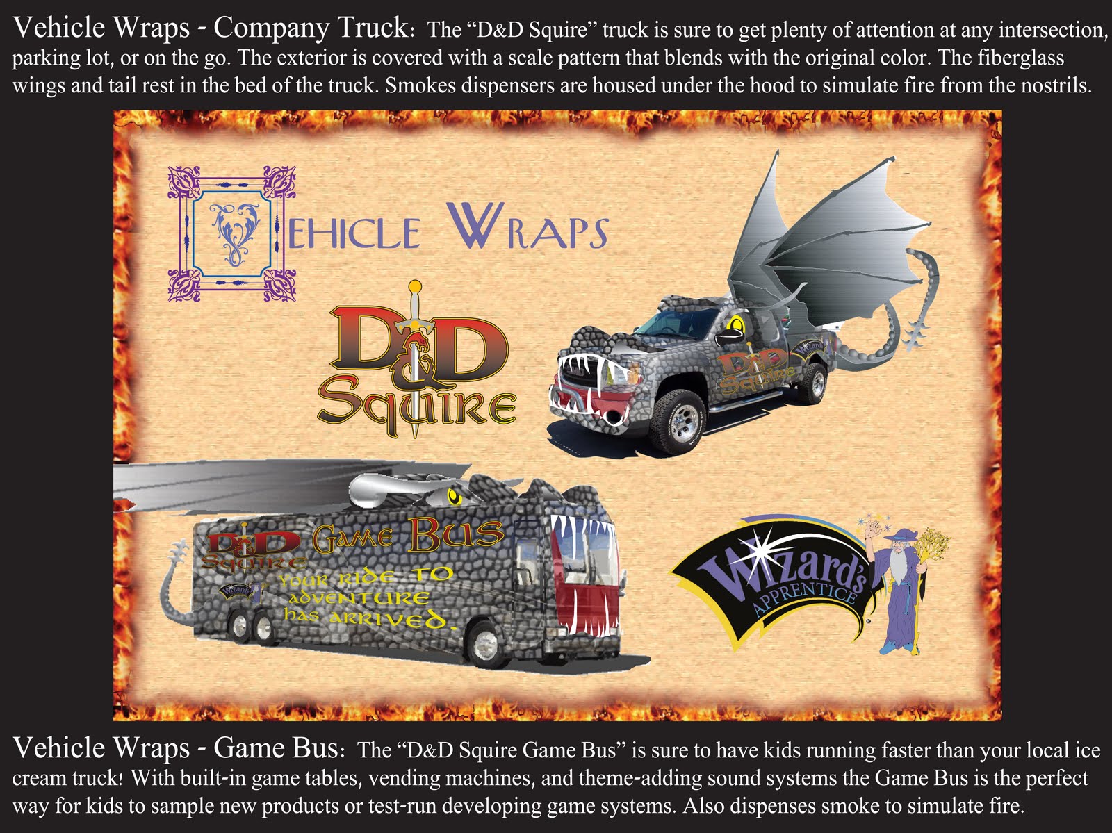
Vehicle Wraps-Final
Unfortunately, due to time and he didn't get to see this one.
Commercial Storyboards-Final
He also loved the storyboards, saying it was some of the best examples of an actual commercial that he'd seen that night (amoung all of the other students).
Package Design-Final
He loved the package design, as well.
Interactive Applications-Final
I can't recall that he said anything specific about this page.
Critique 2
Mission Statement and Logo, Fonts, & Colors-Final
Although he said he did not recognize nor was familiar with the genre/business, he recommended a font that was more legible. He also recommended limiting my fonts to 2, maybe 3. He also added that in a presentation I would want to show the object/concept in question and not have them competing with other elements. He said the background was very busy and listed it as distracting. He stated that the "Ratings" on the Mission Statement was distracting, because it was large and black & white, so his eye went there first.
He also recognized that I was trying to rebrand an entire world and was essentially saying that I had bitten off more than I could chew. He recommended that in the future I rebrand something as simple, like my sunglasses. I took this as an insult, since creating worlds is what I specifically do.
Graphic Elements and Character Illustrations-Final
I can't recall that he said anything specific about this page, although I did have to specify that I created the characters on my own. I remembered that he said he was not familiar with the genre/business. I think he also said he didn't like the idea of mixing fonts together.
Billboard Advertisement-Final
Going back to his concept that I shouldn't have by background items competing with my presentation piece he also stated that each of the items in the billboard all competed with attention. He recommended making them smaller and have the tagline stand out seperately with a banner underneath. I instantly saw a purple banner under the slogan in my mind's eye when he said that.
Printed Advertisement-Final
Like the Billboard, he felt that the items were competing with each other and his eye didn't know where to go.
Vehicle Wraps-Final
He loved the idea of the smoke coming out of the vehicles and mentioned a recent movie where another vehicle did just that in the shape of a Minotaur. He was concerned about the tail and wings and wondered if the wings could be folded. He also half-joked that maybe the truck might need a sign on the back, warning people to stay back.
Commercial Storyboards-Final
He mentioned that with the Character Illustrations having texture and shading he would want to see that in the characters as well, keeping with the consistancy.
Package Design-Final
He mentioned again that he would want to see continued consistancy overall. He recommended having the background also be consistant; either all illustration or all photograph, instead of a mixture of the two. He also said he'd like to see the package design in a situation where it is being used.
Interactive Applications-Final
He did like the idea that an RPG no longer had to be limited to a piece of paper. He said this was a great concept and said it was something that could be used now for the actual company. With that in mind he said this was my strongest piece of the presentation. He mentioned that he'd like to see the characters on the screen be in 3D, instead of flat.
Critique 1
Mission Statement-Final
I can't recall that he said anything specific about this page.
Logo, Fonts, & Colors-Final
He recommended limiting my fonts to 2, maybe 3. Others had given this suggestion as well and it took me until after the semester to finally realize they were referring to the square decoration and leafy font I used inside it. I took the idea from the 1st semester's Design History class, where many of of the old design books started out their paragraphs in such a fashion. He also didn't like the mix of colors in the decorative square border, but those were the automatic color elements provided by Illustrator.
Graphic Elements andCharacter Illustrations-Final
He instantly congratulated me on accepting such a daunting task of trying to rebrand a product to include all ages; children and adults. He mentioned that the Anime characters in the Graphic Element photos were very popular amoung adults, while the kid-friendly aspect appealed to children. He recommended combining both to bridge the gap between the age generations. I told him about my niece Mari's work for my own game Realm Warfare (see my other class "Corporate Identity") and he acknowledged that I was on the right track.
Billboard Advertisement-Final
He loved the Billboard and commented that nobody could drive past it (without missing it).
Printed Advertisement-Final
Vehicle Wraps-Final
Unfortunately, due to time and he didn't get to see this one.
Commercial Storyboards-Final
He also loved the storyboards, saying it was some of the best examples of an actual commercial that he'd seen that night (amoung all of the other students).
Package Design-Final
He loved the package design, as well.
Interactive Applications-Final
I can't recall that he said anything specific about this page.
Critique 2
Mission Statement and Logo, Fonts, & Colors-Final
Although he said he did not recognize nor was familiar with the genre/business, he recommended a font that was more legible. He also recommended limiting my fonts to 2, maybe 3. He also added that in a presentation I would want to show the object/concept in question and not have them competing with other elements. He said the background was very busy and listed it as distracting. He stated that the "Ratings" on the Mission Statement was distracting, because it was large and black & white, so his eye went there first.
He also recognized that I was trying to rebrand an entire world and was essentially saying that I had bitten off more than I could chew. He recommended that in the future I rebrand something as simple, like my sunglasses. I took this as an insult, since creating worlds is what I specifically do.
Graphic Elements and Character Illustrations-Final
I can't recall that he said anything specific about this page, although I did have to specify that I created the characters on my own. I remembered that he said he was not familiar with the genre/business. I think he also said he didn't like the idea of mixing fonts together.
Billboard Advertisement-Final
Going back to his concept that I shouldn't have by background items competing with my presentation piece he also stated that each of the items in the billboard all competed with attention. He recommended making them smaller and have the tagline stand out seperately with a banner underneath. I instantly saw a purple banner under the slogan in my mind's eye when he said that.
Printed Advertisement-Final
Like the Billboard, he felt that the items were competing with each other and his eye didn't know where to go.
Vehicle Wraps-Final
He loved the idea of the smoke coming out of the vehicles and mentioned a recent movie where another vehicle did just that in the shape of a Minotaur. He was concerned about the tail and wings and wondered if the wings could be folded. He also half-joked that maybe the truck might need a sign on the back, warning people to stay back.
Commercial Storyboards-Final
He mentioned that with the Character Illustrations having texture and shading he would want to see that in the characters as well, keeping with the consistancy.
Package Design-Final
He mentioned again that he would want to see continued consistancy overall. He recommended having the background also be consistant; either all illustration or all photograph, instead of a mixture of the two. He also said he'd like to see the package design in a situation where it is being used.
Interactive Applications-Final
He did like the idea that an RPG no longer had to be limited to a piece of paper. He said this was a great concept and said it was something that could be used now for the actual company. With that in mind he said this was my strongest piece of the presentation. He mentioned that he'd like to see the characters on the screen be in 3D, instead of flat.

Subscribe to:
Comments (Atom)