For this class we were given the semester-long assignment to rebrand an existing company of our choosing. Since I'm working on finishing the rebranding of my own game, Realm Warfare, I decided to use the RPG and table-top game company, "Wizards of the Coast." The target audience for their games is who I am aiming for with my game.
As part of my rebranding design I'm trying to include younger audiences to expand their product line and target audience. I'm also hoping to develop better Public Relations in the minds of parents, since a lot of their name brands currently don't sit well in a family setting (Example: Dungeons & Dragons).
This campaign is designed to allow entire families to become involved in game playing and thereby increase relations and communications. It will also allow younger audiences to grow into their current versions.
Tuesday, December 14, 2010


Friday, December 3, 2010
Critique Comments-Final
For the Final day of class our instructor brought in 2 Professional Designers from local businesses to critique our work. Here's what they said:
Critique 1
Mission Statement-Final
I can't recall that he said anything specific about this page.
Logo, Fonts, & Colors-Final
He recommended limiting my fonts to 2, maybe 3. Others had given this suggestion as well and it took me until after the semester to finally realize they were referring to the square decoration and leafy font I used inside it. I took the idea from the 1st semester's Design History class, where many of of the old design books started out their paragraphs in such a fashion. He also didn't like the mix of colors in the decorative square border, but those were the automatic color elements provided by Illustrator.
Graphic Elements andCharacter Illustrations-Final
He instantly congratulated me on accepting such a daunting task of trying to rebrand a product to include all ages; children and adults. He mentioned that the Anime characters in the Graphic Element photos were very popular amoung adults, while the kid-friendly aspect appealed to children. He recommended combining both to bridge the gap between the age generations. I told him about my niece Mari's work for my own game Realm Warfare (see my other class "Corporate Identity") and he acknowledged that I was on the right track.
Billboard Advertisement-Final
He loved the Billboard and commented that nobody could drive past it (without missing it).
Printed Advertisement-Final
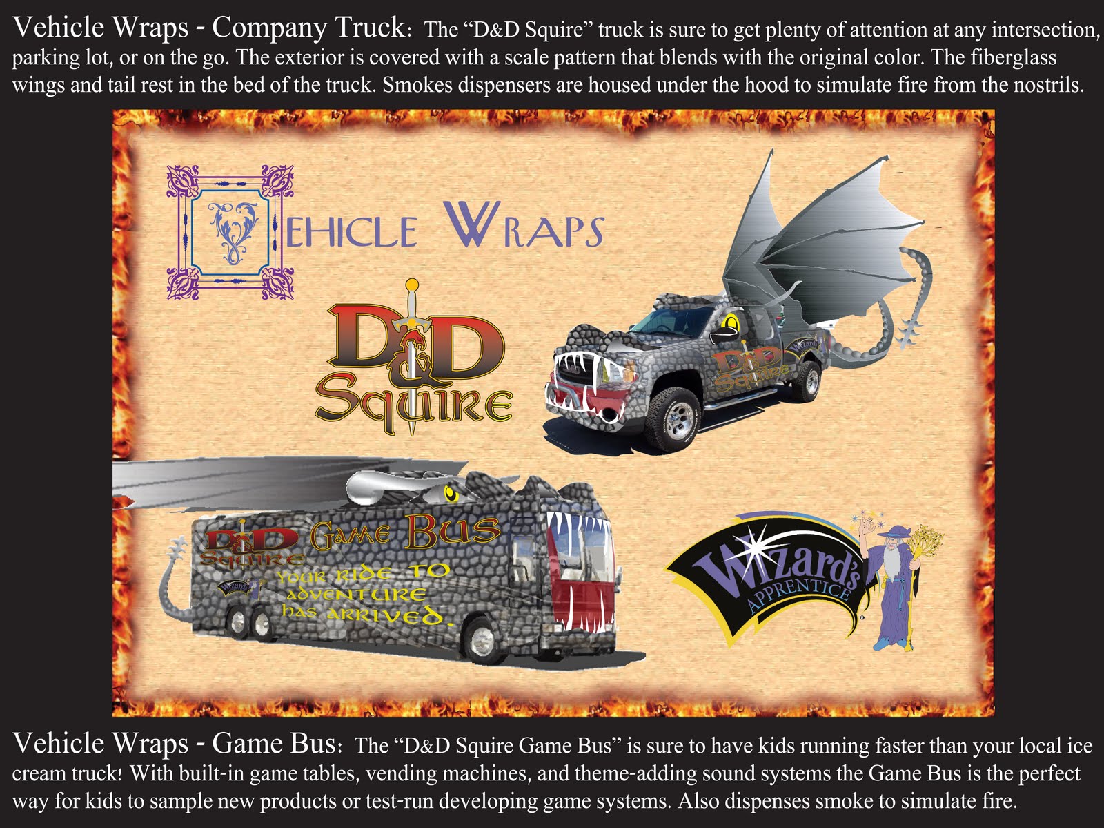
Vehicle Wraps-Final
Unfortunately, due to time and he didn't get to see this one.
Commercial Storyboards-Final
He also loved the storyboards, saying it was some of the best examples of an actual commercial that he'd seen that night (amoung all of the other students).
Package Design-Final
He loved the package design, as well.
Interactive Applications-Final
I can't recall that he said anything specific about this page.
Critique 2
Mission Statement and Logo, Fonts, & Colors-Final
Although he said he did not recognize nor was familiar with the genre/business, he recommended a font that was more legible. He also recommended limiting my fonts to 2, maybe 3. He also added that in a presentation I would want to show the object/concept in question and not have them competing with other elements. He said the background was very busy and listed it as distracting. He stated that the "Ratings" on the Mission Statement was distracting, because it was large and black & white, so his eye went there first.
He also recognized that I was trying to rebrand an entire world and was essentially saying that I had bitten off more than I could chew. He recommended that in the future I rebrand something as simple, like my sunglasses. I took this as an insult, since creating worlds is what I specifically do.
Graphic Elements and Character Illustrations-Final
I can't recall that he said anything specific about this page, although I did have to specify that I created the characters on my own. I remembered that he said he was not familiar with the genre/business. I think he also said he didn't like the idea of mixing fonts together.
Billboard Advertisement-Final
Going back to his concept that I shouldn't have by background items competing with my presentation piece he also stated that each of the items in the billboard all competed with attention. He recommended making them smaller and have the tagline stand out seperately with a banner underneath. I instantly saw a purple banner under the slogan in my mind's eye when he said that.
Printed Advertisement-Final
Like the Billboard, he felt that the items were competing with each other and his eye didn't know where to go.
Vehicle Wraps-Final
He loved the idea of the smoke coming out of the vehicles and mentioned a recent movie where another vehicle did just that in the shape of a Minotaur. He was concerned about the tail and wings and wondered if the wings could be folded. He also half-joked that maybe the truck might need a sign on the back, warning people to stay back.
Commercial Storyboards-Final
He mentioned that with the Character Illustrations having texture and shading he would want to see that in the characters as well, keeping with the consistancy.
Package Design-Final
He mentioned again that he would want to see continued consistancy overall. He recommended having the background also be consistant; either all illustration or all photograph, instead of a mixture of the two. He also said he'd like to see the package design in a situation where it is being used.
Interactive Applications-Final
He did like the idea that an RPG no longer had to be limited to a piece of paper. He said this was a great concept and said it was something that could be used now for the actual company. With that in mind he said this was my strongest piece of the presentation. He mentioned that he'd like to see the characters on the screen be in 3D, instead of flat.
Critique 1
Mission Statement-Final
I can't recall that he said anything specific about this page.
Logo, Fonts, & Colors-Final
He recommended limiting my fonts to 2, maybe 3. Others had given this suggestion as well and it took me until after the semester to finally realize they were referring to the square decoration and leafy font I used inside it. I took the idea from the 1st semester's Design History class, where many of of the old design books started out their paragraphs in such a fashion. He also didn't like the mix of colors in the decorative square border, but those were the automatic color elements provided by Illustrator.
Graphic Elements andCharacter Illustrations-Final
He instantly congratulated me on accepting such a daunting task of trying to rebrand a product to include all ages; children and adults. He mentioned that the Anime characters in the Graphic Element photos were very popular amoung adults, while the kid-friendly aspect appealed to children. He recommended combining both to bridge the gap between the age generations. I told him about my niece Mari's work for my own game Realm Warfare (see my other class "Corporate Identity") and he acknowledged that I was on the right track.
Billboard Advertisement-Final
He loved the Billboard and commented that nobody could drive past it (without missing it).
Printed Advertisement-Final
Vehicle Wraps-Final
Unfortunately, due to time and he didn't get to see this one.
Commercial Storyboards-Final
He also loved the storyboards, saying it was some of the best examples of an actual commercial that he'd seen that night (amoung all of the other students).
Package Design-Final
He loved the package design, as well.
Interactive Applications-Final
I can't recall that he said anything specific about this page.
Critique 2
Mission Statement and Logo, Fonts, & Colors-Final
Although he said he did not recognize nor was familiar with the genre/business, he recommended a font that was more legible. He also recommended limiting my fonts to 2, maybe 3. He also added that in a presentation I would want to show the object/concept in question and not have them competing with other elements. He said the background was very busy and listed it as distracting. He stated that the "Ratings" on the Mission Statement was distracting, because it was large and black & white, so his eye went there first.
He also recognized that I was trying to rebrand an entire world and was essentially saying that I had bitten off more than I could chew. He recommended that in the future I rebrand something as simple, like my sunglasses. I took this as an insult, since creating worlds is what I specifically do.
Graphic Elements and Character Illustrations-Final
I can't recall that he said anything specific about this page, although I did have to specify that I created the characters on my own. I remembered that he said he was not familiar with the genre/business. I think he also said he didn't like the idea of mixing fonts together.
Billboard Advertisement-Final
Going back to his concept that I shouldn't have by background items competing with my presentation piece he also stated that each of the items in the billboard all competed with attention. He recommended making them smaller and have the tagline stand out seperately with a banner underneath. I instantly saw a purple banner under the slogan in my mind's eye when he said that.
Printed Advertisement-Final
Like the Billboard, he felt that the items were competing with each other and his eye didn't know where to go.
Vehicle Wraps-Final
He loved the idea of the smoke coming out of the vehicles and mentioned a recent movie where another vehicle did just that in the shape of a Minotaur. He was concerned about the tail and wings and wondered if the wings could be folded. He also half-joked that maybe the truck might need a sign on the back, warning people to stay back.
Commercial Storyboards-Final
He mentioned that with the Character Illustrations having texture and shading he would want to see that in the characters as well, keeping with the consistancy.
Package Design-Final
He mentioned again that he would want to see continued consistancy overall. He recommended having the background also be consistant; either all illustration or all photograph, instead of a mixture of the two. He also said he'd like to see the package design in a situation where it is being used.
Interactive Applications-Final
He did like the idea that an RPG no longer had to be limited to a piece of paper. He said this was a great concept and said it was something that could be used now for the actual company. With that in mind he said this was my strongest piece of the presentation. He mentioned that he'd like to see the characters on the screen be in 3D, instead of flat.

Thursday, November 18, 2010


Wednesday, November 17, 2010


Summary of "Zag" textbook by Marty Newmeyer
Here are the important summary notes at the end of Marty Newmeyer's book, "Zag" which we used as the textbook for this class. It has many very interesting aspects on how to build a business, grow it, and keep it running against competitors.
1. Marketplace clutter
As the pace of business quickens and the number of brands mulitiples, it's customers, not companies, who decide which brands live and which brands die.
Today's real competition doesn't come from other companies but from the extreme clutter of the marketplace.
Fighting clutter with more clutter is like trying to fight fire with gasoline.
A brand is a customer's understanding about a product, service, or company. It' not what you say it is, but what THEY say it is.
An over-abundance of look-alike products and me-too services is forcing customers to serach for something, anything, to help them separate the winners from the clutter.
The human mind deals with clutter the best way it can-blocking most of it out. What's left, the stuff that seems most useful or interesting, gets labeled and stored in mental boxes.
For the first time in history, the barriers o competition are not controlled by companies, but by customers. The boxes they build in their minds are the boundries of brands.
The goal of brandin is simple: to delight customers so that MORE people buy MORE things for MORE years at a HIGHER price.
Customers tonday don't like like to be sold-they like to buy, and they tend to buy in tribes.
In a marketplace of me-too offerings, people choose on teh basis of tribal identity. "If I buy this product, what will that make me?"
The demise of traditional advertising has 2 causes: 10 People don't like one-way conversations, and 2) People don't trust advertisers.
What people want today are trustworthy brands. What they don't want is more intrusiveness, more empty claims, and more clutter.
In a world of extreme clutter you need more than differentiation. You need RADICAL differentiation. The new rule: when everyone zigs, zag.
2. Finding your zag
To find a zag, look for ideas that combine the qualities of GOOD and DIFFERENT.
Artists are trained to see negative space. Companies need to think like artists when they're looking for new market space, because new market space, or "white space," is the secret to finding a zag.
When you're searching for a need state, don't think so much about the unbuilt product as about the unserved tribe. Look for a job people are trying to do, then help them to do it.
3. Designing your zag
Your need to clarify what business you're in-your core purpose. Core purpose is the fundamental reason your company exists beyond making money.
The leader's job is to shape and articulate the vision, making it palpable, memorable, inspiring. True vision leads to commitment rather than compliance, confidence rather than caution.
Without a clearly drawn vision, employees tend to work at cros-purposes, often taking refuge in functional silos instead of collaborating to tranform a shared picture of teh future into reality.
The power laws that control brand leadership can be reduced to a simple formula:
first mover + popularity = leadership
When focus and differentiation are powered by a trend, the result is a charismatic brand that customers wouldn't trade for love nor money. It's the difference betweeen paddling a surfboard and riding a wave.
While virtures like being innovative, responsive, and customer-focused are admirable, zagging requires that a company define itself by what makes it UNIQUE, not what is admirable.
Brands are subject to what network theorists call "power laws"-laws that explain why succes attracts success, or why "the rick get richer."
In the world of power laws, market-share hierarchies are controlled by customers, who collectively dtermine the success order of competitors.
An "onliness" statement provides a framework for your zag: Our brand is the ONLY ___________ that ________________.
By checking any new business decision against your "onliness statement" you can quickly see whether it will help or hurt, focus or unfocus, purify or modify the meaning of your brand.
One of the most powerful principles in building a brand is focused alighment. The result of alignment is coherence; the result of non-alignment is wasted resources.
If adding an element to your brand brings you in competition with a stronger competitor, think twice. You may well end up wasting energy and confusing your customers.
A brand is part of an ecosystem in which each participant contributes and each participant gains.
Rather than trying to please everyone at the risk of pleasing no one, step right up and pick a fight. Just make sure you take on the biggest, most successful competitor you can find.
It's an ironic fact of marketing that a brand's most valuable asset is often the one given the least attention: its name. A poor name is a drag on the brand building process, and a good name accelerates it.
A name should be, 1. different than its competitors, 2. brief-four syllables or less, 3. appropriate, but not so descriptive that it sounds generic, 4. easy to spell, 5. satisfying to pronounce, 6. suitable for "brandplay," and 7. legally defensible.
All brand communications should emanate from a trueline. A trueline is the one true statement you can make about your brand. It's your value proposition, the reason your brand matters to customers. It can't be reduced, refuted, or easily dismissed.
The key to crafting a trueline is to focus on a single proposition. If you find yourself using commas or "ands" to write your trueline, your may need more focus.
A marketing budget based on zaggin will appear much larger than it actually is. the object is to compete where you can win.
Forget about best practices. Best practices are usually common practices. And common practices will never add up to a zag, no matter how many of them you apply.
Without good execution, a strategy is only a plan-an intention. The road to _______ is paved with good strategy.
Customers experience your brand at specific touchpoints, so choosing what those touchpoint are, and influencing what happens there, is important work.
Customer loyalty is not a program. It starts with companies being loyal to customers-not the other way around-and only becomes mutal when customers feel they've earned the loyalty they're receiving from the company.
If a brand has positive associations for customers, the company may be able to unlock value by extending it-but only it the new extensions reinforce the maning of the original brand.
While there is valuable synergy to be found in brand portfolios, they face four dangers that single brands don't-contagion, confusion, contradiction, and complexity.
CONTAGION is the dark side of synergy. If one brand has a problem, the rest of the portfolio can become infected.
CONFUSION can happen when companies extend their brands past the boundries their customers draw for them. Customers want choice, but they usually want it AMONG brands, not WITHIN brands.
CONTRADICTION can occur when a company tries to extend a brand globally. Customers in one culture may have a different view of a product or cmpany than customers in another culture.
COMPLEXITY becomes a danger as a brand portfolio growns. What began as a way to simplify the brand-building process can easily end up complicating it.
The key to buiilding strong portfolios is subtraction-pruning back brands and subbrands that don't support your zag.
4. Rewnewing your zag
As a company grows, it's attracted toward one of the three "stable states," which we can call scissor, paper, and rock. Each state has its strengths and each has its weakneses, creating a balanced cycle of competition.
A "scissors" company is a startup or small business that competes by cutting out a small area of busines from a much larger "paper" company. Its defining characteristic is extreme focus.
A scissor company grows into a "rock" company that competes by crushing "scissors" companies. Its defining characteristic is momentum.
Eventually, a rock company expands into a "Paper" company that uses its superior network and resources to smother "rock" companies. Its defining characteristic is its size.
Focus beats size, size beats momentum, and momentum beats focus.
Comapnies tend ot COMPETE counter-clockwise- paper covers rock, rock breaks scissor, scissors cuts paper.
Over time, focus grows into momentum, momentum broadens into size, size divides into focus... and the competition cycle begins again.
The spaces between teh stable states are "unstable states" - periods when change is not only possible but necessary. This is the natural time to reinvent your zag.
Seeing where you fit in the competition cycle lets you, 1. exploit your company's strengths and minimize its weaknesses; 2. exploit your competitors' weaknesses and better prepare for their attacks. 3. Use the unstable states to reinvent your zag, and 4. reinvent your zag during the stable states to block a competitive move or simply remain vital.
There's a myth that people in organizations don't like change. Actually, people do like change. What they don't like is BEING changed.
To find the leverage point in your oerganization, just ask these 3 questions: 1. What is stopping the change? 2. How is that a problem? 3. What would have to happen for it NOT to be a problem?
The central problem of brand-building is getting a complex organization to execute a simple idea.
When you find your zag, ask your people how they'll help execute it. You'll be surprised by the amount of energy you released.
The biggest impediment to high performance is short-term focus. Short-term focus is often a reaction to the demands of shareholders, who are quick to sell off non-performing stocks.
Companies that have radically transformed their brands tyhrough differentiation have enjoyed tangib le results, and stock prices have risen 250% per year as they've revived.
When a company needs to get itself from a dying market to an emerging one, the best vehicle may be a "2-stage rocket." It can use the first stage-its existing brand-to fuel the second stage-the new brand.
"Warhol's Law" is inexyricably linked with the big speedup, since constant change requires constant novelty. We're moving into an era of perpetual innovation.
The market as a whole tends to move faster than any one cmopany. In the big casino of the marketplace, the house usually wins.
What I've learned from the reviews & critiques
In our textbook, "Zag," by Marty NewMeyer he talks about a 'branded house' vs. a 'house of branding.'
In one instance, the company (house) is seperate from it's products and/or services so that one is not easily recognizable to another. This is a great way to protect the company's branding for the products in case one product is poorly branded or received a bad branding, like in the case of a bad media review.
One example could be Proctor & Gamble.
In the other instance, all products and/or services are easily recognizable to each other.
A good example in this case would be Disney; all of their products can be seen with each other. Their Cinderella character can be seen on the cover of a book along with Pixar characters, their Winnie the Pooh characters, and even their company mascot, Mickey Mouse.
This scenario not only shares the good but also the bad. When one brand falls, it may take all the others with it. The public may think, "Disney," instead of, "The characters and product line of Brother Bear."
With this review I found this was a perfect scenario between a branded house vs. a house of branding.
Since there have been few people to recognize the name, "Wizards of the Coast," they were quickly confused as to the purpose of the product and the direction of the mission statement itself.
To correct this issue I've decided to include and focus on one of their more easily recognizable product lines, "Dungeons & Dragons" for the rebranding.
With the fantasy theme I began and the direction I was heading in that seemed the perfect product to include to make my statements.
I also recognized that most people didn't understand the overall purpose of the assignment itself. Many even confused this assignment with my own personal project, which I have been rebranding in my Corporate Identity class. This product is a fantasy board game titled, "Realm Warfare."
I recognize this problem came from my instructions, which were not broken up into smaller, readable chunks. Because of the large size of text most people simply chose not to read it.
Other than that, I also did find it interesting how many consumers (target and otherwise) conflicted each other in their opinions.
Many suggestions I found helpful while others were completely off of the mark, due to the poor direction and instruction I provided.
Others were simply going against what was specifically required or instructed in class or the textbook, showing that the rebranding process really is a complicated system of steps; refining, retuning, repeat.
I included the summary of Marty Newmeyer's "Zag" textbook instructions on this blog to help encourage an understanding of the branding and rebranding process. I will keep my previous instructions in their error-format as an example of my miscommunication to my reviewing/critiquing audience.
All of the suggestions that I did find helpful and/or encouraging I am trying to incorporate into the final design. Hopefully the suggestions will assist the presentation to make more sense and bring all the elements together as a whole.
Thursday, November 11, 2010
Review & Critique Comments
PLEASE ENTER REVIEW AND/OR CRITIQUE COMMENTS BY EMAILING ME AT: kerrschool@yahoo.com.
For this assignment, the instructor wanted us to contact others and gather their reviews, critiques, or comments on the work we've done so far.
Feel free to email me your comments in this section on the 6 items listed below. The items to be reviewed are all the Design 3 elements.
With this rebranding, we are imagining that "Wizards of the Coast" is expanding their line to include younger audiences for their line of table-top and RPG games, including "Dungeons & Dragons."
We are also imagining the rebranding to include family friendly versions so that parents can feel safe about their kid's participation and also join in the fun.
There are 6 items to critique: Mission Statement, Logo/Color/Fonts, Mood Board Pictures, Illustrations, Vehicle Wraps, & Billboard designs.
After adding your comment please include your name and age. Feel free to also add a comment by clicking on the red title above if you have a Google account. Otherwise, please email me at: kerrschool@yahoo.com.
While you are visiting the site, feel free to visit my game's site, which is currently being rebranded in my class, Corporate Identity:
http://kkmsrealmwarfare.blogspot.com/
http://kkmscollegecorpidentity.blogspot.com/
Thank you for your reviews!
Kerry Keith Murdock
Critiques and Reviews
Here is a collection of critiques and reviews I received for the assignment.
Matt-My friend, who is a true gamer:
Yo,
OK, so I perrused the files you sent me, and I am not really sure what it is that you want from me, so I'll tell you some things I noticed, some things that need fixing and add a few oppinions and hopefully you'll have gotten what you need.
#1: The mission statement is actually really good. You kept it short and sweet, which, given how long attentions spans are these days, is a bonus. One comment: use of the word gaming for families is unessisary. Draw everyone in. Make this statement for ALL families and ALL friends. Take out the word gaming, and you take in everyone (not just the gamers).
#2: You font logo's and colors are good. Contrasting lights and darks always shows coordination. A more medevil font I think would be really cool, but that's just a oppinion. The huge rating sign is going to hurt your game though. You don't need to tell everyone about everything the game entails. Leave it as a surprise for them. I have witnessed first hand at how mild mannered the game is so I wouldn't go putting it in peoples minds that this game was designed by "Green Bunny" by giving them this huge list of "heres-the-badness-you-can-expect-from-this-box". Rate it E10; leave the list of spoilers behind.
#3: Love the mood photos. They're great- no notes there.
#4: The Character illustrations page ... mixed feelings. Some of those designs need a lot of work. Some don't. I'd have to tell you specifically. If you're gearing this for kids (5-10 years), then they work just fine But for any audiences older than that, you're going to need to sharpen them up a bit and give them a much grittier and adult image.
#5: I like the Dragon Mobile, but what does that have to do with anything. I was a little confused about that? Don't get me wrong it's cool. I want a car like that, but it semmed more than a little out of place with all the Elves, Lichs and Barbarians.
#6: You're commercial for Realm Warfare was actually pretty watchable. You just need to sharpen those images up. Oh, and loose the yellow guy (the guy with all the hair. He's out of place somehow). Do that and you've really got something. Something I'd watch anyway and say, "hm, I wonder if Black Fire has this game in?"
CLOSE: To hammer the nail in, I have played your game before and I know it's great fun (especially for large groups) and would definitely sell. Your presentation- word wise- is pretty on the ball. You just need to be a little more discrete. The big thing that I have to say (as a professional) is that your imagery and drawings still need some work. You need to sharpen your commercial images up (the musical under score was pretty cool too BTW), and get that yellow haired dud fixed. You need a better image of that guy to fix the web spot.
Other wise it looks pretty good. Times a good as it was when I first saw what you ha dgoing for this.
So, a little more fine tuning and you're there.
Thats all I have.
Peace.
Squid- Matthew Moody (Age 32)
Cami-my sister, who is a mother:
Mission statement.
I think the statement is too long. Be careful grammer and spelling
mistakes, any mistakes will put people off, especially investors. You
want to be as professional as possible. Also, you can't claim to be the
"only" games to encourage family communication, just playing together does
that. But, I do like the colors and the lettering. Center the last four
lines.
Logo.
I love the colors. I am a little confused about the wizard's arm. How
does it connect to his body? I love the magical swoosh that dots the "i".
As a mom though, the rating box seems a little overwhelming. All that
violence, blood, alcohol etc. would make me choose another game. I know
you have to have it, but you should make the rating box much smaller, and
the wizard logo much bigger. Emphasize the positive, de-emphasize the
negative.
Mood photos.
We love anime. But can you find some that look more medievil? What does
the girl have to do with anything? These picture just don't seem to go
with the game.
Illustrations.
I like most of them, but I don't like the arrangement. I would prefer to
see a random placement rather than the characters lined up like a research
paper. The red dragon is awsome, the giant and green snake need more
texture and detail, unless it's just so fine that I can't see it, if that
is the case, it needs to be bolder.
Vehicle Wrap
Cool. Just make it bigger to take up some of the negative space in the
bottom right hand corner. I like the way the windshield is so transparent.
Good job.
Billboard.
Put the dragon and knight together! And the spelling you are looking for
is "role" not "roll." Another grammer thing that will loose the sale! I
like the "It's now child's play" phrase, but make it a tiny bit smaller
and increase the size of the logo.
Great work, Kerr! I can tell you've put a lot of work into this. Ken and
I discussed your work and he agrees with me and also with Cameron's
comments. Love you!
Cami Jensen (age 40)
Anna-my mom, who is a grandmother:
The first frame is well balanced and the words and the logo for this are really well done. They are artistic and very pleasing to look at. The positive statement is also well written, except the claim that it is the 'only' table top game is not really true. There are other games that parents can enjoy with their children. So, I recommend it be rewritten with a positive claim but not to the exclusion of all others.
The second frame is well done with an interesting color scheme and font.
The third frame has some great mood pictures. Each of them connote a setting and mood that is very individual and interesting.
The fourth frame is also very interesting with its great variety of different characters. They give thought to a lot of creative ideas.
The fifth frame with the truck is very creative and so fun to see. The texture and the character of the truck are very unique and makes one excited to see the truck go into action.
The sixth frame is a bit confusing with the words crossed out and the red letters, which are difficult to see, written in over the top of them. I really like the logo and the dragon they balance each other very well but the character in the middle is too big to blend in with the other pictures and appears out of place.
Jeff-a neighbor, who is a father:
Kerry,
I'm not sure exactly what you are looking for in terms of a critique but I'll give you my thoughts and hope that it works for your purposes.
The missions statement is a bit confusing. I like the idea of more communication between players, but I'm not sure how video games fits in. Many videos games allow text and even voice communication between players. Also it seems that all table-top games have an element of communication that is inherent in them.
I like the logo. It seems very friendly to families and younger audiences. Nice choice. I also like the logo type. It fits the genre and is readable. I couldn't read the text in the small circles. I'm not sure how they fit into the presentation. The rating seems appropriate for the rebranding you are trying to do.
The mood photos seem to fit the new brand. They would be engaging to the younger audience and seem to fit the genre well.
The character illustrations seem to fit also. They are appropriate for a younger audiences and engaging while not being overly scary.
I'm not sure how the vehicle wrap fits in. It seemed over-the-top if it was for an actual vehicle and didn't seem to fit the audience you are target.
I hope this helps.
Jeff
Brian-my friend, who is a graduated artist:
Going from the top, down.
• PRESENTATION MISSION STATEMENT 3
I didn't read that it was a Mission Statement until the third time I read the statement itself.
A Mission Statement should be more about the ongoing intent of the company rather than a commentary on modern social practices relative to the company's products and services.
* I found a misspelling of the word PRECEDENCE.
* If you're satisfied with the wording as it is, I would only suggest, instead of "The only table-top games...", consider "Providing table-top games...".
• PRESENTATION LOGO, FONT, COLORS, AND TARGET AUDIENCE 3
* Logo - I'm not keen on the design of the Wizard, but I like the banner/title.
* Font - The font in the logo doesn't match the font stating what the font is.
* Colors - I like the colors you chose, but the black (charcoal gray) in the logo doesn't match the black in the circle (background) displaying the RGB/CMYK.
* Target Audience - RED FLAG! That rating doesn't speak "family" to me. I know there isn't anything you can do about the game content, but your marketing techniques should reflect that--especially your Mission Statement.
• PRESENTATION MOOD PHOTOS 3
Am I being nit-picky? I recognize that the photos represent the TYPE of game that it is (fantasy), but I didn't get any "mood" out of it. Perhaps I just don't understand this aspect of the assignment.
• PRESENTATION CHARACTER ILLUSTRATIONS 3
It's impressive that you were able to use your own art work for this part of the assignment--I think that could/should get you extra credit. A more professional look, however, might be to "cartoon-ize" some existing characters from movies using Photoshop or Illustrator.
• PRESENTATION VEHICLE DESIGN 3
I like the concept, but some aspects aren't very practical (ie. the wings and the nostrils).
A few things you may want to take the time to fix:
* It looked like you used a stone wall as the scales. Use your Transform: Warp tool to make it look like it actually wraps around the vehicle.
* There's lots of negative space. Enlarge the vehicle OR... show the wrap on another vehicle such as the Nissan Cube or the VW Bug.
* Show how the wings and nostrils could work as part of the wrap if they couldn't be added to the vehicle.
• PRESENTATION BILLBOARD DESIGN
I'm sorry, I'm out of time so I'm going to be very curt about this one.
It looks lazy. I think you should scrap it and start over.
Got to run. If you have any questions about my review I'll discuss any and all of it with you whenever you like.
- Brian Sheets
Donna-my wife, who is an accomplished artist
Kerr,
The color scheme is very nice. The arching of the text helps to bring your eye full circle and keeps your attention on on the title. The characters are fun, and I like how they range in both size and species - not everyone wants to be a human or humanoid all the time. I love the dragon truck! I would totally drive that around town! Does it breath fire?
I don't really understand the collage of anime pictures, (it seems almost out of place, like it doesn't belong with your other cute pictures) but over all, I think you have executed your purpose.
-Donna Murdock - age 31
Nathan-my friend, who is also a game designer:
Mission Statement
It is not very concise. I would have done something like. "Bringing, adventure, imagination and strategic thought to the gaming table since 1992."
Cameron-my best life-time friend, who is an accomplished businessman and fan of my game "Realm Warfare":
Mission Statement:
My thought is that a mission statement is written primarily to guide the employees and stock holders of the company about the goals of organization. It should give direction and help formulate the strategy of the company. With this in mind, I think this statement sounds too much like a sales pitch to me. Also, its a bit wordy in my opinion.
Fonts & Colors
I like the colors, the purple and yellow both seem very wizardly, nice. I'm not sure what happened to the wizard's arm on this picture (maybe he has an invisibility cloak draped over his arm. LOL). I think the font is nice as well, and I like the old world style of the font. I'm not sure I like the all caps style in the mission statement, but that’s more of a personal preference, its harder to read in my opinion.
As for the target audience, I think you are going down the right track trying to opening it up to all audiences, but I wonder if you considered that by making things a little too friendly for the family crown you may alienate your existing clientele (teenagers and young adults). Just a thought.
Mood Board Photos
Dragon picture is nice, I'm not sure if the Japanese animation really matches with your wizard and the purple and yellow colors. I would recommend sticking with the old world style, knights, Merlin, castles, etc seem to fit better than some of these pictures.
Illustrations
I like the character illustrations. My favorites from the top left to the bottom right are: purple wizard, archer, medusa lady, blue dragon, knight in armor, snake, marsh monster, red dragon, scorpion, death, feral dog (really cool) and the minotaur. Some of the others I had a hard time seeing, and I increased the magnification on my browser to 200%.
Vehicle Wrap
All I can say is TOTALLY AWESOME!!!!
Billboard
Billboards are tricky. I often find myself critiquing them as I drive by. Two things that are commonly done wrong on billboards in my opinion: 1. They are too difficult to read or understand. 2. Not interesting enough, and it doesn't get you to remember what was said.
In my opinion you have too much on this billboard. Also, how is this going to drive people to buy your product (no web address to visit, and or no memorable statement that will make me want to look up the product online or at the store.)
Since you have a company that 95% of the world has probably never heard of before you have a very difficult task. My personal opinion would be, do a billboard that grabs peoples attention, and gets them asking, what was that about, so they research it further. When they go to a web site, then they can learn about how these games are family friendly. But I would try to make it look cool and desirable, and not worry about telling the story of what the company is all about on the billboard. Just my opinion. Enjoy!
Diane-My sister in law, who is an accomplished accountant
Kerry,
I liked all of your drawings. They were bright, colorful and eye-catching. If I were looking through a magazine or catalog and saw these, I would read a little more about the product. I also think that your logo is cool and also eye-catching. I am no artist by any means and just an ordinary person, but these would definately make me want to look into the company and the product that they are selling. I don't know what the people in your class are looking for, but I think they are being way to critical of your work. I think these are great and I'm not just saying that because you are my brother-in-law. Take care, Diane.


Subscribe to:
Comments (Atom)